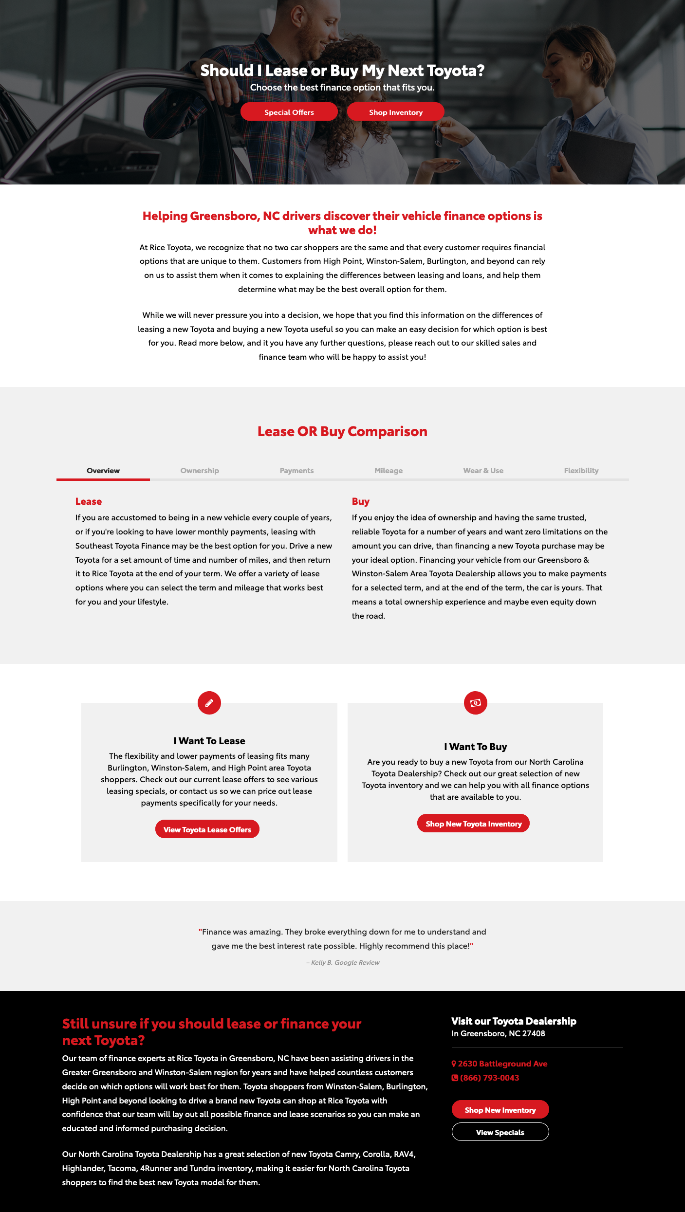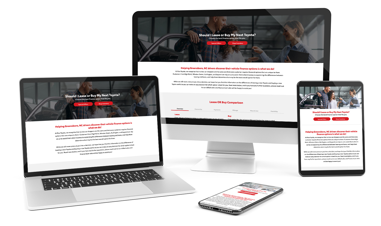
Responsive Landing Page

Rice Toyota is a high ranking dealership which takes great pride in their ability to offer unmatched service and value. Through transparent business practices and a commitment to educate buyers, they've earned themselves generations of customer loyalty. One of the topics they like to educate buyers on are the difference between leasing or owning a vehicle. To help make this decision process easier for customers, I created this page demonstrating those differences.
My Role: Digital Designer, UX/UI Designer, Web Developer
Skills Practiced: Collaboration, Graphic Design, Photo Editing, Sketching, Wireframing, Coding, JS Manipulation
Tools: Pencil & Graph Paper, Adobe Photoshop, Adobe XD, Adobe Dreamweaver
Dynamic Beacon / June 2020
Light Gray
HEX: #E3E3E3
RGB: 227, 227, 227
Dark Gray
HEX: #2B2B2B
RGB: 43, 43, 43
Black
HEX: #000000
RGB: 0, 0, 0
White
HEX: #FFFFFF
RGB: 255, 255, 255
Red
HEX: #D71920
RGB: 215, 25, 32


Early on in the design process, the client vocalized the importance of providing enough content to answer any possible question a customer might have. Although a smart marketing approach, having too much information can sometimes overwhelm users causing them to bounce off the page or the website entirely.
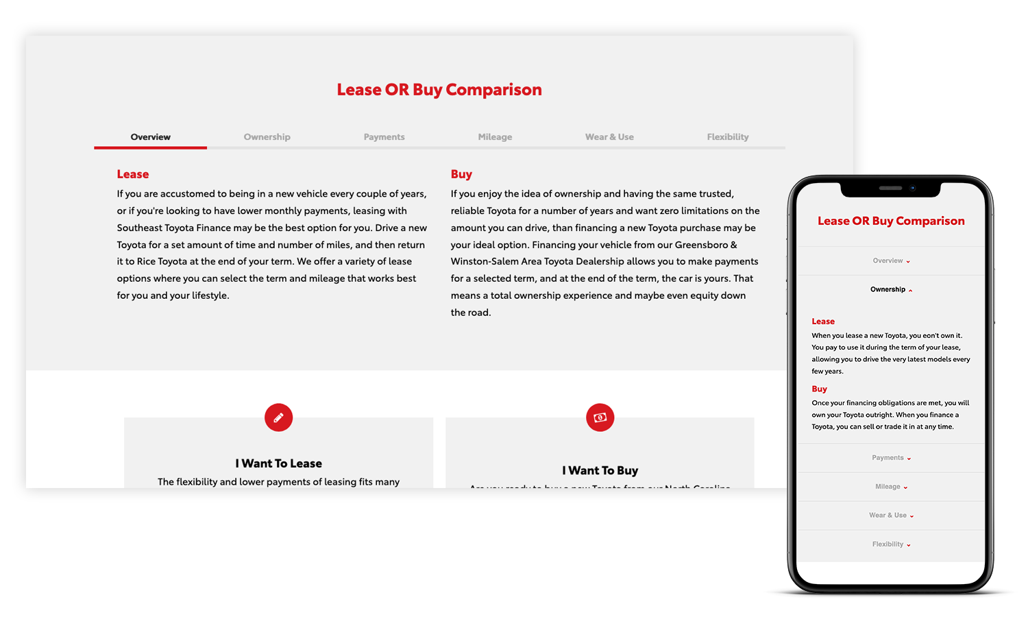
To keep viewers engaged on desktop, I thought the functionality of a tab‑system would be the perfect solution. Essentially it would allow for a user to click through each category to compare information, without confusing or overwhelming them. On the UI front, highlighting the active tab state and dulling the inactive ones would also help users to keep their place while navigating through content.
On mobile however, the experience of having a tab‑system of this proportion changes for the worse. The smaller screen, the more condensed the content needs to be. For the tab‑system, this means categories would have to stack on mobile, causing the loss of precious screen space.
By switching to a drop‑down accordion or drawer system on tablet and mobile views, the interface is decluttered. Similar to the tab‑system UI, a red accented down arrow indicates to the user that drop‑down functionality is available. Users are now able to scroll with ease, opening and closing each section as needed.
Sessions
New Sessions
New Users
Avg. Session Duration
Bounce Rate

Metrics gathered from Google Analytics.
Performance comparison dates: April 26, 2020 ‑ June 24, 2020 // June 25, 2020 ‑ Aug 23, 2020