
As COVID‑19 took its toll on the small businesses within my community, most people began to see the importance of maintaining or establishing a digital presence. Specifically in the food industry, there was an increased demand for online ordering capability and food delivery services.
During a time when grocery store inventory ran low, I said to myself: 'I wish I could buy all my produce from local businesses instead of this chain store.' and that's when it hit me. What if there was an online marketplace where people could shop for their groceries, but it was all locally sourced? And what if these items could be delivered?
I then came up with the concept of Farm Fresh and decided to create a mobile app for ordering, similar to DoorDash and GrubHub. The way I saw it, an online market and delivery app would help stimulate the local economy, reduce the amount of time spent grocery shopping, and eliminate the hassle of driving to seperate locations to get the best deal.
My Role: Visual Designer, UI Designer, UX Designer
Skills Practiced: Typography, Branding, Information Architecture (IA), High Fidelity Wireframing, Prototyping
Tools: Adobe Illustrator, Adobe XD
Rachel David / May 2020
White
HEX: #FFFFFF
RGB: 255, 255, 255
Light Gray
HEX: #E3E3E3
RGB: 227, 227, 227
Dark Gray
HEX: #2B2B2B
RGB: 43, 43, 43
Black
HEX: #000000
RGB: 0, 0, 0
Gray Green
HEX: #F2F5F2
RGB: 242, 245, 242
Green
HEX: #42BE3E
RGB: 66, 190, 62
Orange Crush
HEX: #EFA600
RGB: 239, 166, 0

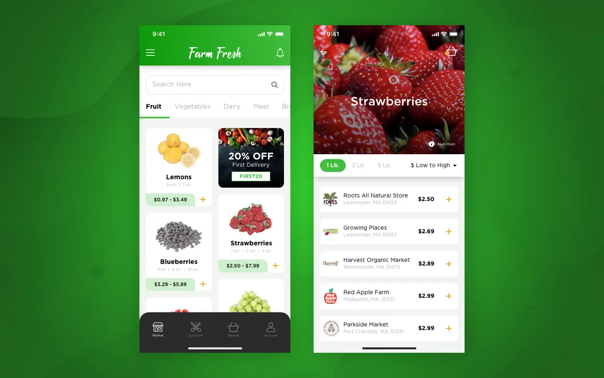
When an item is selected from the Market Homescreen by tapping on the '+' symbol, a list of local farmers markets is generated based on the available package size options. The user is then able to see and compare item pricing. To enhance user experience, I added a Sort By button so the user could sort the vendor list by pricing and reviews.
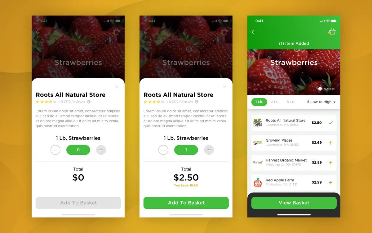
Once a vendor is chosen, and a secondary menu swipes up with product information and a quantity counter. Upon tapping the '+' symbol, a dollar value is presented and the 'Add To Basket' button glows green. After an item as been added to the basket the swipe menu slides back down to reveal a confirmation banner a green check mark next to the vendor listing.
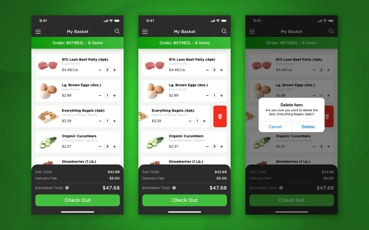
The My Basket screen shows a scrollable a list of the items you've gathered. Anchored at the bottom is an estimated total for your grocery order, which includes a break down of fees plus a 'Check Out' button. To remove an item from the basket, a swipe‑left gesture activates the trash can icon. Once a user taps on the trash can, the background dims and a confirmation menu appears.