
Growing up in Massachusetts I'd often hear the old Mark Twain saying: "If you don't like the weather in New England, just wait a few minutes". This was proven to be true when in January 2015, Fitchburg, MA experienced blizzard‑like conditions followed by a beautiful sunny 54° day.
At the time I was taking an Interface Design Course and for my first assignment I was given the challenge of redesigning an iPhone app. As I sat at my workspace brainstorming ideas I remember hearing a classmate say, "It's so hot out. Didn't we just get like 9‑inches of snow yesterday?". That's when the lightbulb went off... how funny and ironic would it be if I redesigned the Weather App, but just for New Englanders?
Wicked Weathah started out as a joke, but then it quickly snowballed into something bigger when I tried to find more ways to incorporate New England culture. Now, over five years later, I've revisited this app design concept as a way to demonstrate my growth as a Visiual Designer.
My Role: Visual Designer, UI Designer, UX Designer
Skills Practiced: Typography, Branding, Information Architecture (IA), High Fidelity Wireframing
Tools: Adobe Illustrator, Adobe XD
Rachel Caron / Sept 2020
White
HEX: #FFFFFF
RGB: 255, 255, 255
Light Gray
HEX: #F1F1F1
RGB: 241, 241, 241
Black
HEX: #000000
RGB: 0, 0, 0
Cloudy Blue
HEX: #36475A
RGB: 54, 71, 90
Deep Blue
HEX: #14549B
RGB: 20, 84, 155
Sunshine Orange
HEX: #F2AB0B
RGB: 242, 171, 11


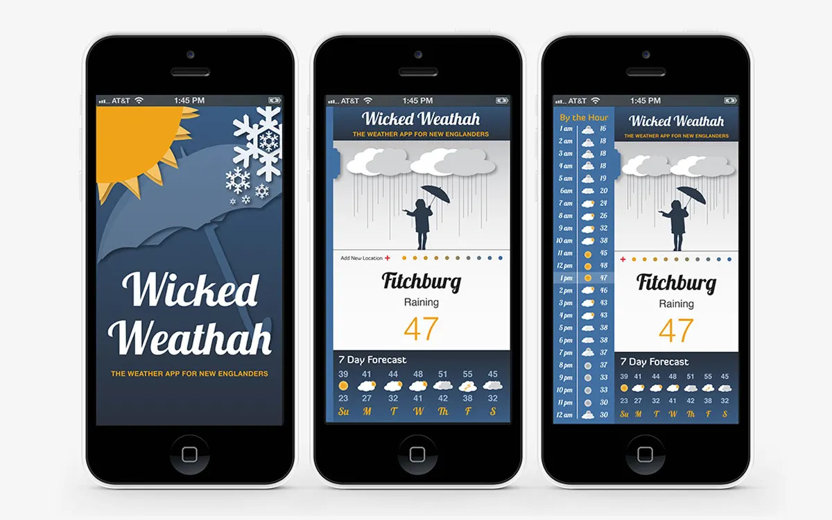
For my 2015 design concept, I envisioned the Wicked Weathah App to function similar to the current iPhone weather app, with the ability to swipe right to different locations and indicator dots to represent the number of total locations. At the time, I recognized the amount of data I was trying to share with viewers could seem overwhelming so I left the 7‑Day Forecast up front as a responsive module, but made the decision to condense the ‘By The Hour‘ data into a side menu, activated by a tap or right swipe.

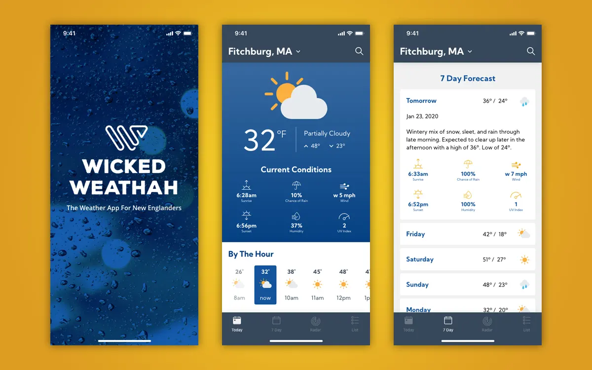
The 2020 Wicked Weathah concept was almost a complete overhaul. Starting with the branding, I wanted a modern and bold vibe so I chose a thick easy‑to‑read typeface and paired it with abstract 'W'. For legibility purposes, I replaced the Lobster font with the Kumbh Sans font family, which came in 3 different weights.
For greater hierarchy, I moved the city name above the weather data and then added drop down functionality so users could easily switch between saved locations. In the top right corner I also added a search icon so users had the ability to find new locations, no matter which screen they were viewing.
Most notably, I added a bottom navigation, which would give users the opportunity to toggle between screens and features. This was important because I was then able to remove the old 'By the Hour' side menu, open up the interface, and design a seperate screen for the 7 Day Forecast data.